One of the first things people notice when going to Confluence Cloud is that content seems to be stuffed into the middle of the page with a lot of white space on either side. This is different from almost every other word processor or documentation software as they tend to put the content right up against the edge of the screen to maximize real estate.
Personally I think they do this to make it easier to focus on content, however, regardless of reason it can be annoying since it seems to waste a lot of the screen. Fortunately, you can change it!
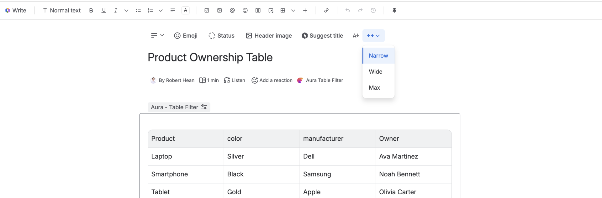
Changing the page width is easy, but requires finding a (somewhat) hidden button up in the header. All you have to do is put your cursor over the page header, click on the <--> menu and select the width you want. This will instantly change how much space the content takes up (and how much white space is left).
There are three options - "narrow" (the default). This puts the content roughly in the middle of the page, but leaves a lot of white space on either side.
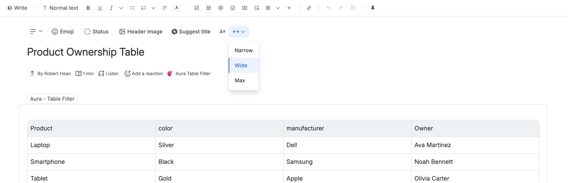
Wide will push the content to the edges. Note that if you have an ultrawide monitor it may not get all the way to the edge!
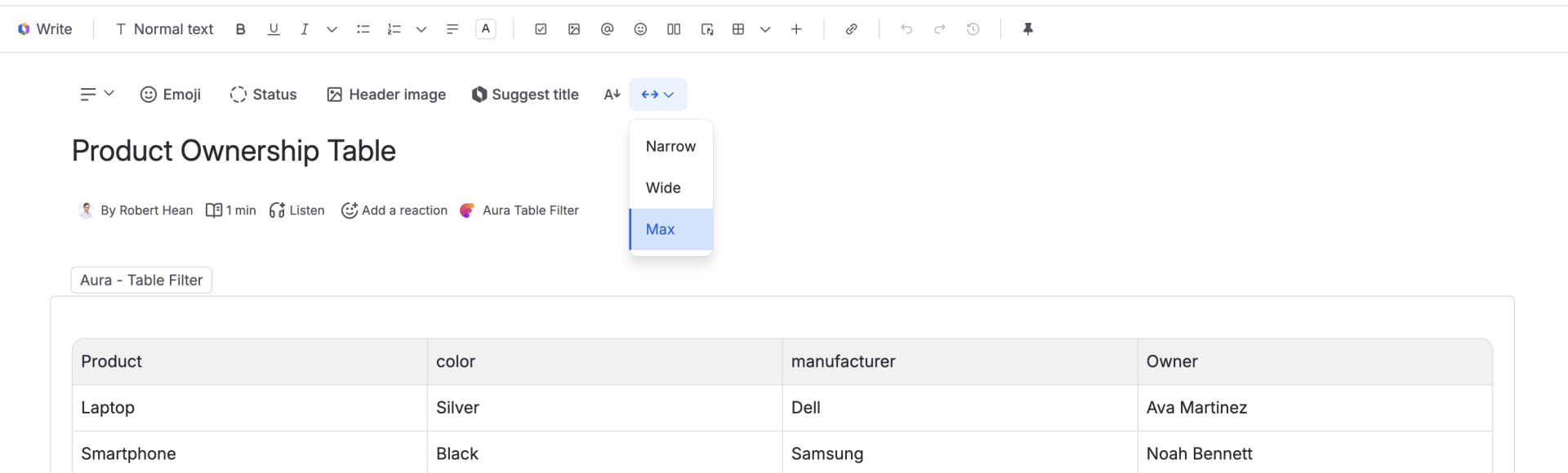
Max pushes the content all the way to the edge (note this may look the same as "wide" on most monitors). It's most useful for wider tables or content that requires more horizontal space.
If I'm being honest, most of the time I'm using Narrow. I find it helps keep my text focused on, making it easier to write (and read) what is on the page. This makes it idea for any text-heavy content (which is mostly what I end up putting on a page). I find it also handles most images/videos very easily, and even displays most tables (although if I find tables getting too big I tend to make then a database anyways...).
I find myself using "Wide" any time I have a bigger image and I want the structure of the page to roughly line up with the image (since Narrow will result in narrow text, with a wide image sticking out the sides). Wide is also good any time I have a table with more columns that will overflow the Narrow width (while it doesn't break anything, it can look odd to have the table stick out the sides).
I rarely use Max, although I know folks who have ultra-wide monitors that swear by it. Max helps with very content-heavy pages that have lots of stuff you want to see.